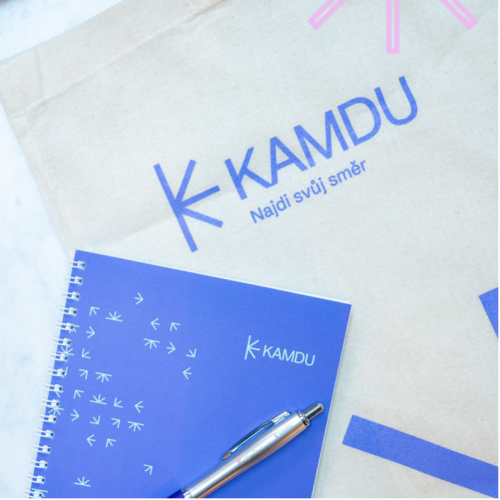
When Kudy Kampus came to us looking for a simple evolution of their existing logo, we spotted a much bigger opportunity. By renaming the organisation Kamdu it made for a more interesting and fun way of expressing what it did and a means to get into the vernacular. Along with this, we developed a completely new look and brand for it. One which further brought to life what they did. The new look references ‘directional’ signage and ‘arrows’ which help students attending the campus understand all the possible directions they could take with their future education, career and growth. All of this culminated in a complete brand book which enables the organisation to communicate clearly, consistently and meaningfully in any channel they wish too.


